Here I have look fonts for my brand name. I have decided to call my beauty brand Saz( I haven't yet decided the name of the collection)
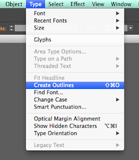
Firstly I chose all the fonts from Adobe Illustrator which I liked for my brand, I then manipulated them by selecting the font, choosing Create Outline and then Ungroup, this meant I could change each letter separately.
Illustrator Font:
Here I have rearranged the letters to overlapped vertically, similar to the Yves Saint Laurent logo.
I like this font for its simplicity yet with the serifs it stills looks high end.
Here I did something similar with a sans-serif font, i am not too keen on this one as I think it looks a bit naff.
With this font I simply created more space between each letter , I love this font I think it gives of the impression of affluence which is what i want to go for. I also like the way the S and the Z look almost like reflections of each other.
Dafont.com Fonts:
These are font that I got from the website Dafont
The serif type face of this text gives it an affluent feel to it, similar to fonts that are connected to high end fashion brands and magazines. Personally I like the the 'tall and thin' look of the font.
Again , similar to the one above however this is a bolderversion of the font. I think that this would stand out a lot more on the packaging.
I found these two sans-serif fonts very interesting, I like the way the 'A' is slanted giving it a more modern touch that the previous fonts I have looked at, however I think for my product that it wouldn't be suited very well.


No comments:
Post a Comment