Showing posts with label Unit 34. Show all posts

Monday, 6 July 2015

Worksop bus station , planning the layout


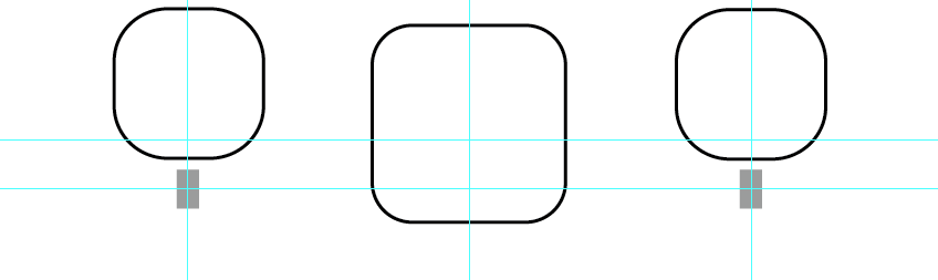
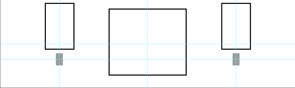
Now we have all finished our artwork for the wall of the bus station it is now time to decided who's will go up/ how we are going to display it. To decide on this we have all created templates. Firstly i have created a page on Illustrator which has been scaled to represent the wall(10X3 cm) , i then added rulers at the centre and then 3/4 down to make sure everything was in line. 
I added the lights to wall (grey boxes) so i could fix the boxes around them.


I then added my designs to tho a photo which one of my class mates took of the wall. By doing this i can see how the proxemic


Friday, 3 July 2015

60's Poster Research


I have decided to base my worksop bust station art work on 60's psychedelic artwork.
I love the bright and bold contrasting colours used in the artwork and the fluid lines used to build up the back ground whilst simultaneous making the main image ( or text) the focal point.

These are some of my favourite images which i have found on google.


I love colours used in this images, and how they are swapped for each of the background squares


In this image i like how the orange and blue are used to make the hair, the colours really stand out  against the black and camel background


I love the water-colour effect on this one and the faded text.


I think the blue really stands out against the orange in this one and i like the traced around the person effect.


This image is really simple but with the purple standing out so strongly against the orange, really effective.


I love the colours used in this one and the face with the stitching effect on it.


Wednesday, 24 June 2015

Bus station artwork


As well ass our designs for the curtain walling for the bus station we have also been asked to create a piece of artwork for one of the walls. The artwork will be 10x3 metres (est.) large.
For my piece i have decided to take influence from 60's psychadellic art.
I researched into 60's posters give me ideas of colours to use. bright colours were used mainly and most posters stuck to 3 colours.


I used this poster as my main influence. Firstly I drew my bus using photoshop, using a photo from google to work from. I then block coloured in my bus using the green and blue from the poster.


Next i put my bus on a photoshop page which was sized 10X3 cm.
I coloured the background in with the same blue. And added lined following the shape of the bus in a red. 
 One  had drawn around the bus I then added a boarder following the same style as the poster.


I then decided to fill in the empty space with text. I went onto Dafont.com and onto the 'Groovy' theme where I found this text. I then changed the colour and added it to my image where I used the "Distort" tool to manipulate the text. 


Next i decided to try some other colour options, I found the next poster on google. I really like the colours used and to me, they scream 60's.


Here is my finished piece in the new colours,  I think the colours look good together and I may prepare this scheme over the blue and green.


I finished off by adding my text.


For my next design i decided to do it circle form(much like my other bus station designs)
I stuck with pink, yellow and orange. However went for a paler shade of each.

The following poster was my inspiration for my design. I really like the way the circles represent Hendrix's afro. 


Tuesday, 23 June 2015

Trips, Cards of Humanity


For this one day project our task was to create poster to show what collage was like on the first day. our class came to a decision to do this in the style of Cards against humanity, with pictures .


I was given the topic of Trips, for this I decided to use photos from the trips  our art class have been on.I ended up using photos from our trip to London(The dinosaurs from the Natural History Museum and the sign post was one I found outside it) , The Andy Warhol Campbell's soup tin from his exhibition at the Tate in Liverpool and the Xbox controller from the Media museum in Bradford)

I firstly imported my images into Photoshop , I then made my images black and white. I created new layers and added bright colours to parts of my images to give them that 'Pop' and help them stand out.


In conclusion I am quite happy with my outcome, to say this was a one day project and we weren't given our individual topics till we arrived I thought that mine finished to a good standard

Monday, 15 June 2015

National geographic

For this one day project we were to create our own version of the National geographic front cover. everybody added the same effect to their faces with the same border(though not in the same colour) so they would all look consistent when placed together for out end of year show.


firstly I saved my image under a new name, and cropped the back ground out. I then went into 'selective colour' chose white and took out all the yellow,blue and red to give it a crisp white background.


I then made two layers , one named darken(with the darken effect) and one named lighten (with the lighten effect) these were then taken down to the opacity of 40% and 60% 


I then used the blur tool to guve myself the 'airbrush' effect.

next I merge the layers into one.


Next I created a layer mask


and used the eraser tool in my clothes hair eyes and mouth, so only my skin was airbrush ( otherwise it looks unrealistic) 


I played around with duplicating myself and changing the colour , however for my final piece I did not chose this 

Next I added my border , I chose lilac and it was time to add my photo and quote 


I chose to quote ' I woke up like this, flawless' which I thought was quite fitting.