Saturday, 3 January 2015

LSG: Armin Hofmann


Hofmann was a teacher of typography at the Basel school of Design. His students and collagues helped with work and theories surrounding the Swiss International style: 

The International Typographic Style( known as the Swiss Style) is a graphic design style developed in Switzerland in the 1950s that emphasizes cleanliness, readability and objectivity.The style boasts asymmetric layouts, use of a grid, sans-serif typefaces and flush left, ragged right text. This style also uses photography. Many of the early International Typographic Style works featured typography as a primary design element and it is for this that the style is named.

Hoffman is most known for his posters which emphasized economical use of colour and typeface which he referred to as the "trivialization of colour". 

His work as well as others such as Emil Ruder, Max Bill and Josef Müller Brockmann assisted modernist inspired graphic design without which contempory graphic design would be unrecognisable.

Friday, 2 January 2015

LSG: Evaluation

The aim for this project was to create the front and back cover for the new North Notts College Learner Survival Guide( a student handbook). I made 3 final main designs(not including the variations of colour/layout of some).

Initially I started my research by creating a mind map of things that are popular among the target audience and jotted down the first ideas which came to me of what the Learner Survival Guide cover could look like, this then transition into further ideas.

Next I took this forward and did online research: For my first design I looked into existing food and drink logos before deciding on Starbucks as it a popular brand among the target audience.I then manipulated the logo to say LSG 2015/16 with the North Notts college logo in the centre.

For my second design I looked into: Firstly surrealism(Mainly Dali) and secondly surrealism photography which is where I discovered the thought of incorporating a lightbulb onto the cover as it is usually the idiom for a 'bright idea'.Which I thought fit well with with education and learning. For this is also found inspiration in Neville Brody's typography for the text on the cover and I used sans-serif text with black and grey boxes around the bold font. 

Last, for my final design I looked back to my mind map where I thought of the idea of having a music based cover. I originally was thinking of the idea of having vintage headphones on the cover but instead I decided to make it more modern therefore I based it upon Apple's iPod Classic, which I own myself, for the final design.I liked the idea of having this as I feel it stands out to the target audience as they will associate it with the brand Apple which is now very mainstream.


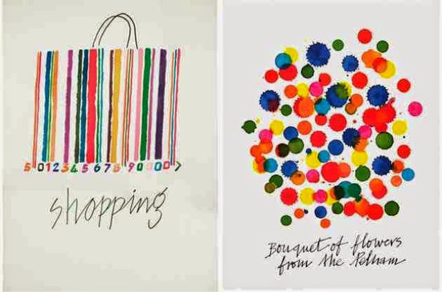
Next I researched into graphic designers: Alan Fletcher and Neville Brody (as well as their inspirations for example art movements such as Dada which I wrote about on my blog).I looked into the Magazine 'The Face' which Neville Brody designed for and the Pentagram which Alan Fletched founded. I found their work very inspiring , I particularly liked the way Neville Brody used different sizes and colour of text to make words stand out and the bright water-coloured effect of Fletcher's work and the logo he created for the Victoria and Albert Museum. 
However I feel I didn't incorporate this enough into my own ideas ergo so I would of liked to create another final piece  based upon this.

After looking at graphic designers I decided to look at Univeristy prospectus ,one reason for this is that they are to deign to not only stand out and catch the eyes of people but to convey a message to the reader about the Univeristy. Upon looking at many different prospectus which I have I saw that they to were inspired by graphic designers and art movements. I then took this inspiration to my own work looking at composition and typography.

In retrospect I found that in the beginning stages I was lacking in inspiration therefore, if I was to re-do this project, I would do more preliminary research into existing booklets to think of more innovative ideas. Then perhaps I would find myself with more then 3 final designs which, though I feel are strong designs which communicate a message to the tagert audience, could be altered to create more final designs which are stronger.


Monday, 15 December 2014

LSG: University Prospectus


Here I have photographed some of the many Univeristy prospectus' that I own , i have focused on the front covers off each prospectus, rather then the actual university. Looking at the graphics that each prospectus has on its front covers.

Looking at these I can see how graphic designers have influence modern day designs for example Neville Brody's technique of different sized/colour font to make words stand out can be seen in many of the prospectus'.

When looking at each prospectus I can see how some Univeristies went for a simplistic and minimalist approach (Norwhich, Westminister, Bath Spa , Liverpool and London college of contempory arts for example) using just a few words or small images against white or brightly coloured backgrounds. Royal holloway , Falmouth , Southhampton and Leeds college of arts however, used photographs/artwork scaled to the full size of the booklet as to capture the attention of the viewer with only a small amount of text (normally just the Univeristies logo) which strongly contrasts the minimalist approach.

The Univeristy of Essex and London Met used just text on their front covers. Both uni's took a very different approach to it however with Essex using white text against a black cover and the same font and size was used through out most of the cover with certain words or phases highlighted in silver( some of these Include 'Challenge inequality' , 'You're a member' and 'Courage and Energy' ) Which shows they wanted to convey a strong meaning. 
London metroplitian Univeristy however used bold colours( bright pink, purple and teal) with bold sans-serif typography in white and yellow saying simply "Under Graduate Prospectus 2015-16". 

Both Falmouth and Leeds college of art used (what I assume to be) artworks of the students for their front covers (this makes sense as they're art based universities). Leeds went for a collage effect while Falmouth bold paintings.

Saturday, 13 December 2014

LSG: Alan Fletcher

I particularly love the way Fletcher has used the word 'Manhattan' to create the illusion of the skyscrapers in New York. 

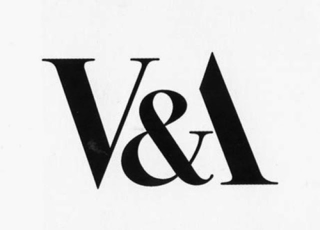
The Vicortia and Albert Muesum logo Fletcher created is still in use today. The serif typography he has used gives the logo an affluent feel to it yet it is very simple design which is highly recognisable.

I love the simplicity and bright eye-catching colours of these 3 water coloured effect designs.


"the most highly regarded graphic designer of his generation, and probably one of the most prolific". 
                              - The daily Telegraph 

Fletcher has worked for many clients including Penguin books, Cunard and Pirelli with his designing firm ,founded in 1962 , 'Fletcher/Forbes/Gill' (with Collin Forbes and Bob Gill) which he left in 1965. This soon became known as Pentagram in 1972 when 2 more partners joined. 

Many of fletches logo are still in use , most famously is the Victoira and Albert Meseum logo (shown above).

" Design is not a thing you do. It's a way of life." 
       -Alan Fletcher's obituary in the Times


Skeleton Drawings: Part 4


For my first drawing I used pencils whilst sat on a donkey I found this enjoyable and I am with my outcome 

For the second part of the lesson however we were given sticks with charcole cello taped on the end. I found using this technique difficult to grasp at first but after a few attemptes I feel like I was actually getting the hang of drawing this way, though it is much harder to create a detailed piece.